The way text is used to influence our emotions
Images and text can go hand in hand. But sometimes text can be used to make the image more powerful or easier to understand. But also good uses of text can our influence our emotions, making use want to take action or feel a different way.
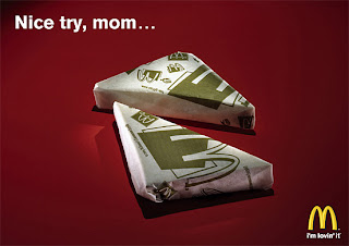
Below is an ad for McDonalds, this plays with our childhood emotions. The ad is very simple and clean, it lets the text and the images do all the talking. It features an image of homemade sandwiches wrapped in McDonalds packaging. Without the text, the ad could have many meanings depending on its context. But the text makes it more clear and easy to understand. The text ‘Nice try Mom’ evokes our emotions and memories of our parents trying to disguise food. However in this case it’s a mom disguising food in McDonalds packaging. The ad is persuading the audience to go and buy McDonalds activating our hunger emotions.
How can you add text to change what an image means
As a designer you should never under estimate the power of text. Text speaks to us directly and gets our opinions across in black and white; people don’t have to make their own random assumptions of what it means.
But we can also use the power of text to change what an image means or make it more personal to us. Depending on its audience and context, text alongside photography can work very well and explain what the picture is saying.
Below is a poster for Levi’s. It features a man made out of copper wearing Levi jeans. But without the text I wouldn’t have been able to known any of this information. By just looking at it, it looks like a film poster. But depending on its context and audience people could make other presumptions about it.


No comments:
Post a Comment